This vignette gives an introduction and guide to the visual and quantitative capabilities and functions of the Prova package, for the study of associations, correlations, and links.
See the vignette('start') for an introduction to the
package. The present vignette continues with the same example and
dataset.
Probabilities and associations
The vignette('start') focuses on the dataset
datasets::penguins, and shows how to calculate
probabilities of single and joint variates from that dataset; also
probabilities conditional on given variates. These probabilities refers
to a new unit; for example:
- If we find that \(\mathrm{Pr}(\text{species}\mathrel{\!=\!}\text{Adelie}) = 44\%\), then there’s a 44% probability that the next penguin we sample (from the same population) is of the Adélie species.
- If we find that \(\mathrm{Pr}(\text{species}\mathrel{\!=\!}\text{Gentoo} \,\vert\, \text{island} \mathrel{\!=\!}\text{Biscoe}) = 1\%\), then if we have a new penguin, and we know it is from Biscoe island, there’s a 1% probability that it is of the Gentoo species.
And these probabilities can also be interpreted as “estimates” of the corresponding whole-population frequencies.
Joint probabilities and conditional probabilities already give a
quantitative measure of the “association”, “correlation”, or “link”
between several variates. They tell us for instance that it can be rare
or very common to observe particular pairs of values together; or that
it is rare or very common to observe values of some variates in cases
where other variates have particular values. In the example above, it’s
rare to observe the value 'Gentoo' of the variate
species in penguins that have value 'Biscoe'
for the variate island. These associations are extremely
important in fields like medicine, where we may want to diagnose or
prognose a disease from possible symptoms, or we try to understand which
clinical conditions are associated with the disease, possibly because of
underlying biological reasons.
We shall now explore first some visual ways to examine associations with Prova, and then some more precise quantitative ways, which also apply when visualization becomes impossible.
Generating and plotting new samples
Setup
Let’s load the Prova package, if we haven’t already done so, and set a random seed to ensure reproducibility:
As in the vignette('start'), we work with a specific
population of penguins, of which we have 344 sample data stored in the
dataset datasets::penguins, included in R version 4.5.0 and
above. For your convenience, for instance if you have an older R
version, you can also download the shuffled dataset as the CSV file penguins_shuffled.csv,
then load it with the pread.csv() function as follows:
We assume that we have already learned all predictive information
from this dataset by means of the Prova function
learn(). This information is stored in a
Knowledge object, which is either loaded in memory, or
stored in the compressed file K.rds within the output
directory that was specified in the learn() function. For
your convenience the object produced by the computation mentioned above
can be downloaded as the file Kall.rds.
Once you have downloaded it in your working directory you can just
set
K <- 'Kall.rds'in this case K is just a character string pointing to
the file containing the actual “Knowledge” object.
Generating new samples
Let’s focus on the island and species
variates. Each variate has three possible values;
Prova’s utility function vrtgrid() allows
us to create a vector of all possible values of each variate, which are
stored in the metadata of the K object:
islandvalues <- unlist(vrtgrid('island', K))
# [1] "Biscoe"    "Dream"     "Torgersen"

speciesvalues <- unlist(vrtgrid('species', K))
# [1] "Adelie"    "Chinstrap" "Gentoo"
The function pplot() allows us to display the
island and species variates against each
other, for all sample data, as a scatter plot:
pplot(x = penguins$island, y = penguins$species,
    type = 'p', col = 4, xlab = 'island', ylab = 'species',
    xdomain = islandvalues, ydomain = speciesvalues)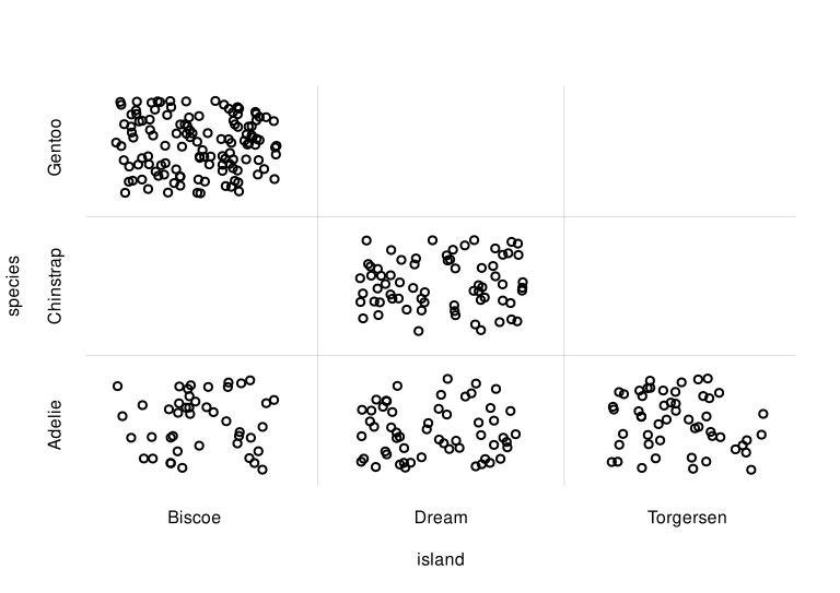
Scatter plot of sample data
Note how pplot() automatically add a slight jitter (by
means of base::jitter()) to the discrete variates, so that
the points don’t just overlap rendering the plot otherwise
incomprehensible.
We immediately see some basic features of these variates in this sample. For example:
- the most common occurrence is the pair
island = 'Biscoe'andspecies = 'Gentoo'; - the pair
island = 'Torgersen'andspecies = 'Chinstrap'does not occur at all.
These are only features of this specific data sample, however. Can we
generalize them to the whole population? Intuitively it seems
probable that the 'Biscoe'-'Gentoo' pair can
indeed be the commonest occurrence in the whole population as well. But
we can’t say for sure that the
'Torgersen'-'Chinstrap' pair never occurs in
the whole population: our sample included only 344 penguins, so what we
can say is that this pair roughly occurs less frequently than once every
344 penguins. In fact, a calculation with the Pr() function
shows that its probability is around 0.3%:
prob <- Pr(data.frame(island = 'Torgersen', species = 'Chinstrap'), K)

print(prob)
#    value      +/-    Q5.5%     Q25%     Q75%   Q94.5%
# 0.002944 0.000036 0.000430 0.001191 0.003999  0.00777
This example shows the limitations of using sample data for visualizing
features of the whole population. How would a scatter plot
analogous to the one above look like, for the whole population
of for a much larger sample?
The Prova package offers the function
rPr() to generate a data.frame of fictitious samples from
the estimated frequencies of the whole population. These samples can be
used for different purposes, for instance to produce a scatter plot. The
main arguments of rPr() are:
-
n: a positive integer, the number of samples to generate. -
Ynames: vector of variate names; samples are generates for these variates jointly. -
X: data frame of variate values to restrict the sampling to specific subpopulations. -
K: the object that encodes theKnowledge from the computation made with thelearn()function.
Let’s first generate 5 samples from the estimated whole population of penguins, as an example:
rPr(5, c('island', 'species'), K)
#        island   species
# 644_1   Dream Chinstrap
# 996_1  Biscoe    Gentoo
# 1228_1  Dream Chinstrap
# 2230_1  Dream Chinstrap
# 3083_1 Biscoe    Adelie
This could have also be entered more explicitly as
rPr(n = 5, Ynames = c('island', 'species'), K = K).
The rows of the resulting data frame are named according to the Monte
Carlo samples used from the K object; they can be useful
for peculiar studies but we can completely ignore them in the present
case.
Now let’s generate 2000 samples, and then plot them in a scatter plot:
samples <- rPr(2000, c('island', 'species'), K)

pplot(x = samples$island, y = samples$species,
    type = 'p', col = 4, alpha.f = 0.5,
    xlab = 'island', ylab = 'species',
    xdomain = islandvalues, ydomain = speciesvalues)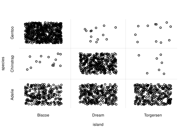
Scatter plot for whole population
The scatter plot above correctly reflects the estimated features of the whole population.
Example with a continuous and a discrete variate
The sampling and plotting from the previous example is easily
extended to any other pair or variates, or even to pairs of sets of
variates. Let us visualize for instance the joint probability of
body_mass and species with another scatter
plot.
We generate 2000 whole-population samples of the two variates with
rPr(), and then scatter-plot them with
pplot(). First we select an appropriate plot range for the
continuous variate body_mass by means of
Prova’s utility function vrtgrid(): this
function chooses an optimal value based on, and including, the range of
data previously observed:
body_massrange <- range(vrtgrid('body_mass', K))

samples <- rPr(2000, c('body_mass', 'species'), K)

pplot(x = samples$body_mass, y = samples$species,
    type = 'p', col = 5, alpha.f = 0.5,
    xlab = 'body mass / g', ylab = 'species',
    xlim = body_massrange, ydomain = speciesvalues)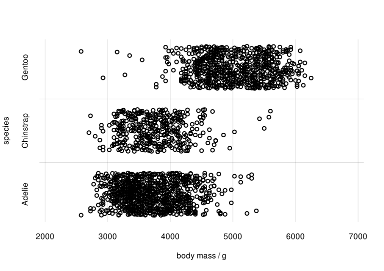
Scatter plot for body mass and species
Note again how pplot() automatically add a jitter to the
discrete variate species, but not to the continuous
body_mass.
From the plot we see that there is an association between the Adélie
and Chinstrap species and lighter body mass, around 3500 g; and between
the Gentoo species and heavier body mass, around 5000 g. Incidentally,
this reflects the probability plot at the end of the
vignette('start').
Samples and plots for different subpopulations
In a completely analogous way we can visually assess the association
of two continuous variates, such as body mass and bill length
(bill_len):
bill_lenrange <- range(vrtgrid('bill_len', K))

samples <- rPr(2000, c('body_mass', 'bill_len'), K)

pplot(x = samples$body_mass, y = samples$bill_len,
    type = 'p', col = 6, alpha.f = 0.5,
    xlab = 'body mass / g', ylab = 'bill length / mm',
    xlim = body_massrange, ylim = bill_lenrange)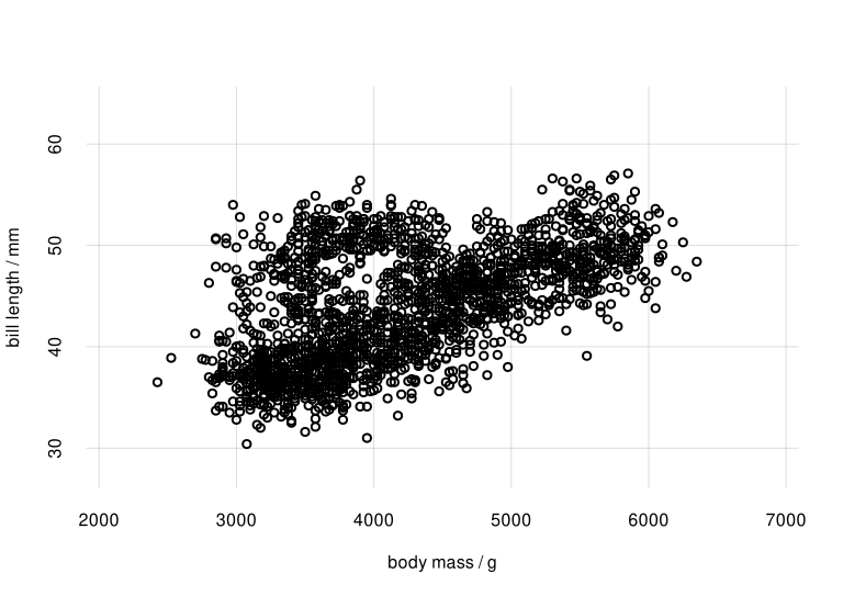
Scatter plot of body mass and bill length
The scatter plot shows that there is a partly linear relationship between body mass and bill length; but there’s a sort of additional cluster around 4000 g for body mass and 45 mm for bill length.
This observation leads to another interesting question: is the
association between body_mass and bill_len
different for different species? Perhaps the additional cluster is
characteristic of one species only. We are therefore interested in
studying this association for different
subpopulations.
Subpopulation sampling and plots can also be easily done with the
rPr() and pplot() functions. In the
rPr() function we can specify the requested subpopulation
via the X argument, analogously to the Pr()
function.
Let’s generate sets of samples separately for the species
'Adelie', 'Chinstrap',
'Gentoo':
samplesAdelie <- rPr(1000,
    c('body_mass', 'bill_len'),
    data.frame(species = 'Adelie'),
    K)
## ## or more explicictly:
## samplesAdelie <- rPr(
##     n = 1000,
##     Ynames = c('body_mass', 'bill_len'),
##     X = data.frame(species = 'Adelie'),
##     K = K)


samplesChinstrap <- rPr(1000,
    c('body_mass', 'bill_len'),
    data.frame(species = 'Chinstrap'),
    K)

samplesGentoo <- rPr(1000,
    c('body_mass', 'bill_len'),
    data.frame(species = 'Gentoo'),
    K)
Now we plot these samples together with pplot(),
choosing different colours and shapes for the three subpopulations. We
also use the alpha.f argument to make sure that the plot
points don’t completely cover one another:
pplot(
    x = list(samplesAdelie$body_mass,
        samplesChinstrap$body_mass,
        samplesGentoo$body_mass),
    y = list(samplesAdelie$bill_len,
        samplesChinstrap$bill_len,
        samplesGentoo$bill_len),
    type = 'p', pch = c(0, 2, 5), col = 1:3, alpha.f = 0.2,
    xlab = 'body mass / g', ylab = 'bill length / mm',
    xlim = body_massrange, ylim = bill_lenrange)

legend('top', speciesvalues, pch = c(0, 2, 5), col = 1:3,
    horiz = TRUE, bty = 'n')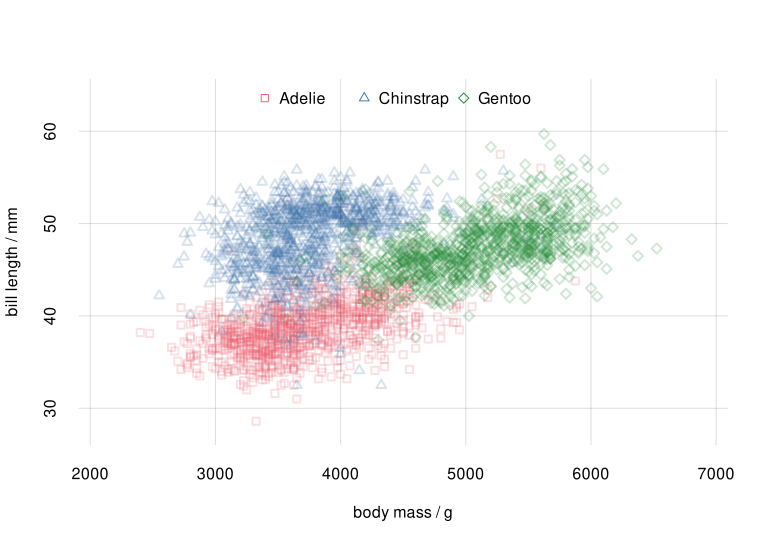
Scatter plot for species subpopulations
The plot above shows quite clearly that the
body_mass-bill_len association is indeed
different for each species. The roughly linear relationship that we
thought we saw earlier was partially spurious, coming from the
combination of associations for Adélie and Gentoo penguins.
Quantifying associations and correlations: mutual information
Pearson correlation coefficient and its limitations
Plots like the ones above allow us to explore in a qualitative or semi-quantitative way the associations and correlations between two or three different variates and for different subpopulations. But we would like to quantify associations in a more precise way. And visualization may become impossible when we want to study the association between complex sets of joint variates.
One very common and quite abused measure of “association” is the Pearson correlation coefficient, usually denoted “\(r\)”. This measure is extremely limited, however. It is essentially based on the assumption that all variates involved have a joint Gaussian distribution (Goodman, Kruskal 1954). As a consequence, it is a measure of linear association, rather than of general association.
For instance, if the distribution of two continuous variates \(Y_1\) and \(Y_2\) lies in a semicircle, then \(Y_2\) is actually a function of \(Y_1\), and is therefore perfectly associated with \(Y_1\): if we know \(Y_1\), then we can exactly predict the value of \(Y_2\). Yet the Pearson correlation coefficient between the two variates is \(0\) in this case, simply because the functional dependence of \(Y_2\) on \(Y_1\) is not linear. Here is an example plot and value:
Y1 <- seq(-1, 1, length.out = 129) ## Y1 values
Y2 <- sqrt(1 - Y1^2) ## Y2 values: function of Y1

## Calculate Pearson correlation coefficient
r <- cor(Y1, Y2, method = 'pearson')
print(r)
# [1] 0

pplot(x = Y1, y = Y2, type = 'p', col = 7,
    xlab = 'Y1', ylab = 'Y2',
    main = paste0('Pearson correlation for this dataset: ', signif(r, 2)))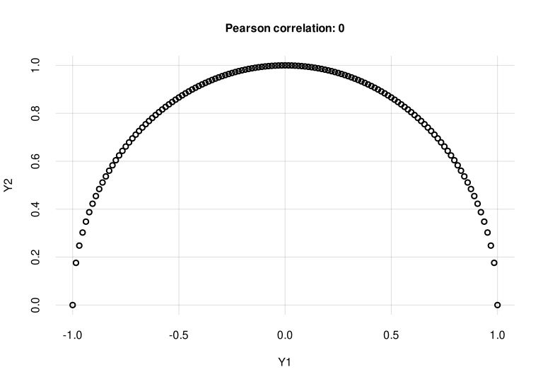
Perfect correlation from \(Y_1\) to \(Y_2\), with zero Pearson correlation coefficient
Similar limitations of the Pearson correlation coefficient are demonstrated by the “Anscombe quartet” of datasets (Anscombe 1973).
The Pearson correlation coefficient, moreover, cannot be used in the case of ordinal or nominal variates. Yet there can be clear associations among these kinds of variates, as was shown for the island and species variates.
Mutual information
Is there a measure of association that enjoys at least the following three properties?:
- It quantifies general associations, not just linearity.
- It does not make any assumptions (such as Gaussianity) about the distribution of variates.
- It can be used for any kind of variates.
The answer is yes, there is! It is called the mutual information or mean transinformation content between variates \(Y_1\) and \(Y_2\). It has the following important properties:
If there is no association whatever between \(Y_1\) and \(Y_2\), in the sense that knowledge of one never changes our probabilities about the other, then the mutual information between them is zero. Vice versa, if the mutual information is zero, then there is no association of any kind between \(Y_1\) and \(Y_2\).
It can be defined for a pair of variates \(Y_1\), \(Y_2\) of any kind – continuous, nominal, binary, joint variates; images, audio signals, and so on.
It is defined for any probability distribution \(\mathrm{Pr}(Y_1, Y_2)\) for the two variates, without assumptions such as Gaussianity.
Mutual information is always positive or zero, and can be defined in several mathematically equivalent ways, such as the following:
\[ \sum_{y_1, y_2} \mathrm{Pr}(Y_1 \mathrel{\!=\!}y_1, Y_2 \mathrel{\!=\!}y_2) \, \log_{2} \frac{ \mathrm{Pr}(Y_1 \mathrel{\!=\!}y_1, Y_2 \mathrel{\!=\!}y_2) }{ \mathrm{Pr}(Y_1 \mathrel{\!=\!}y_1) \cdot \mathrm{Pr}(Y_2 \mathrel{\!=\!}y_2) } \; \mathrm{Sh} \]
with integrals replacing the sums in the case of continuous variates. It is measured in shannons (symbol \(\mathrm{Sh}\)), or hartleys (symbol \(\mathrm{Hart}\)), or natural units (symbol \(\mathrm{nat}\)). These units and other properties of the mutual information are standardized by the International Organization for Standardization (ISO) and the International Electrotechnical Commission (IEC).](https://electropedia.org/iev/iev.nsf/display?openform&ievref=171-07-10).
Mutual information is in fact a core quantity of communication theory and information theory. The design and assessment of communication channels, as well as of compression algorithms, depends crucially on it. This makes sense: the main requisite of a communication channel is a strong association between two variates: its input and output messages. You can find a brilliant introduction to its meaning and uses in MacKay (2005) and Cover & Thomas (2005).
The Prova package provides the functions
mutualinfoF() and mutualinfo() to calculate
the mutual information between two variates or two sets of joint
variates. Function mutualinfoF() can be used only to
calculate the mutual information between groups of variates that have a
finite number of possible values (finite domain), like the
species or island variates, but it is
extremely fast (seconds). Function mutualinfo() can be used
with any kinds of variates, but it is much slower (tens of minutes). The
main arguments of these functions are the following:
-
Y1names,Y2names: two vectors of variate names; the mutual information is calculated between these two sets. -
optionally
X: data frame of variate values to restrict the calculation to specific subpopulations. -
K: the object that encodes theKnowledge from the computation made with thelearn()function. -
Optionally,
unit: the mutual information unit; default “shannons” (Sh). -
Optionally,
parallelThis argument specifies how many nodes we should use for the computation, or a cluster previously generated withparallel::makeCluster(). If this argument is missing, then the function checks whether a default cluster (set withparallel::setDefaultCluster()) exists, and if it doesn’t then it creates a number of nodes equal to the R option “cl.cores” (seegetOption()), or equal to 2, if that option is unset. In the present example we tell Prova that it can use up to 4 nodes; change this value to one that works for your system – or just skip this step if you don’t want to bother with parallel computation for the moment:
options(cl.cores = 4) # use up to 4 nodesLet’s calculate the mutual information between the variates
island and species, previously discussed and visualized. These are
nominal variates with a finite number of possible values, so we can use
mutualinfoF():
MIislandspecies <- mutualinfoF('island', 'species', K)The resulting object MIislandspecies is a list of
several quantities; the mutual information is given in the
$value element, and its unit in the $unit
element:
MIislandspecies$value
# [1] 0.626638

MIislandspecies$unit
# [1] "Sh"
Between variates island and species there
is thus a mutual information of 0.63 Sh. But what does this mean?
Understanding mutual-information values
You might argue: “sure, this mutual information has all these wonderful properties, but what does its value actually mean? I know how to interpret a value of the Pearson correlation coefficient \(r\)”.
It’s important to be fair though. Remember the very first times you learned and used the Pearson correlation coefficient: were you able to give a meaning to “\(r = 0.23\)” for example? was that value high or low? We learned how to interpret \(r\) values only through repeated use and application to real situations. The same is true of mutual information: through repeated use and application, you’ll develop an understanding of its possible values.
Mutual information does have an operational meaning. Saying that the mutual information between \(X\) and \(Y\) is \(h\,\mathrm{Sh}\), means that knowledge of \(X\) reduces, on average, \(2^h\) times the number of uncertain possibilities of \(Y\). For example suppose that a clinician during a diagnosis is equally uncertain about four possible diseases. There is a particular clinical indicator associated with the disease and the mutual information between the indicator and the disease is \(0.415\,\mathrm{Sh}\). Then, upon testing the clinical indicator, the clinician will be roughly uncertain among three possible diseases, rather than four, because knowledge of the indicator reduces the four possibilities by \(2^{0.415}\) (\(4/(2^{0.415}) \approx 3\)). If the mutual information were \(2\,\mathrm{Sh}\) instead, then the indicator would tell the disease with certainty, as it would reduce the four possibilities by \(2^{2}\) (\(4/(2^{2}) = 1\)).
But the functions mutualinfoF() and
mutualinfo() have an additional output to help you get a
rough understanding of the mutual-information value. In the special case
of two continuous variates having a joint Gaussian
distribution, there is a precise relationship between their mutual
information \(I\) and their Pearson
correlation coefficient \(r\):
\[ I = -\frac{1}{2} \log_{2}\bigl(1 - r^2\bigr)\;\mathrm{Sh} \,,\qquad \lvert r\rvert = \sqrt{1 - 2^{- 2 I/\mathrm{Sh}}} \]
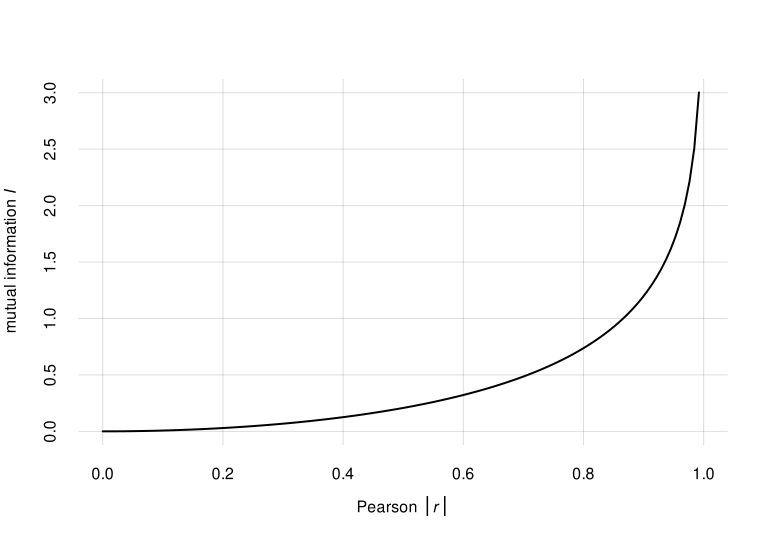
\(I\) vs \(\lvert r\rvert\) for jointly Gaussian variates
This relationship can be a rough guide to get familiar with
mutual-information values also for non-Gaussian variates. The
mutualinfo() function has an additional output element
$rGauss$ with the corresponding \(\lvert r \rvert\) value. In the previous
case of the island and species variates we
have
MIislandspecies[c('value', 'unit')]
# $value
# [1] 0.626638
#
# $unit
# [1] "Sh"

MIislandspecies$rGauss
# [1] 0.761909
Mutual information for previous examples
Let’s re-display the scatter plots of the three pairs of variates explored previously, and calculate also their mutual information.
Island and species
## mutual info, previously calculated
mi <- signif(MIislandspecies$value, digits = 2)

## approx r-equivalent
r <- signif(MIislandspecies$rGauss, digits = 2)

samples <- rPr(2000, c('island', 'species'), K)

pplot(x = samples$island, y = samples$species,
    type = 'p', col = 4, alpha.f = 0.5,
    xlab = 'island', ylab = 'species',
    xdomain = islandvalues, ydomain = speciesvalues,
    main = paste0('mutual information: ', mi, ' Sh',
        '  (rough r-equiv: ', r, ')') )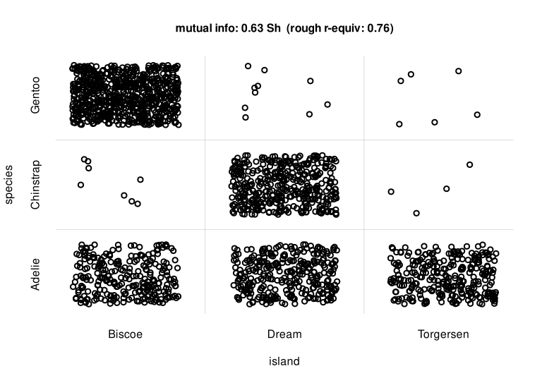
Scatter plot for island and
species
Body mass and species
Calculation of mutual info: “body mass” is a variate with an infinite
number of possible values, so we use the function
mutualinfo():
MIbodymassspecies <- mutualinfo('body_mass', 'species', K)Scatter plot:
## mutual info
mi <- signif(MIbodymassspecies$value, digits = 2)

## approx r-equivalent
r <- signif(MIbodymassspecies$rGauss, digits = 2)

samples <- rPr(2000, c('body_mass', 'species'), K)

pplot(x = samples$body_mass, y = samples$species,
    type = 'p', col = 5, alpha.f = 0.5,
    xlab = 'body mass / g', ylab = 'species',
    xlim = body_massrange, ydomain = speciesvalues,
    main = paste0('mutual information: ', mi, ' Sh',
        '  (rough r-equiv: ', r, ')') )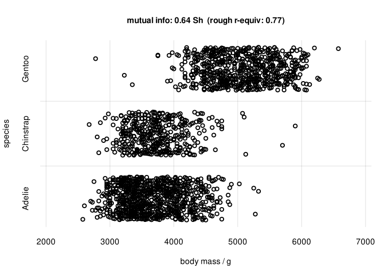
Scatter plot and mutual info for body mass and species
Body mass and bill length
Calculation of mutual information:
MIbodymassbilllen <- mutualinfo('body_mass', 'bill_len', K)Scatter plot:
## mutual info
mi <- signif(MIbodymassbilllen$value, digits = 2)

## approx r-equivalent
r <- signif(MIbodymassbilllen$rGauss, digits = 2)

samples <- rPr(2000, c('body_mass', 'bill_len'), K)

pplot(x = samples$body_mass, y = samples$bill_len,
    type = 'p', col = 6, alpha.f = 0.5,
    xlab = 'body mass / g', ylab = 'bill length / mm',
    xlim = body_massrange, ylim = bill_lenrange,
    main = paste0('mutual information: ', mi, ' Sh',
        '  (rough r-equiv: ', r, ')') )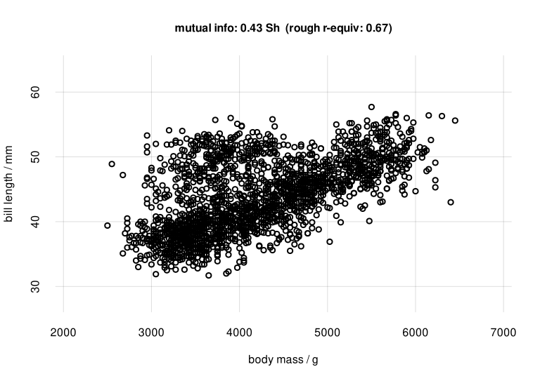
Scatter plot and mutual info for body mass and bill length
Note that in this case the Pearson correlation between
body_mass and bill_len is
cor(samples$body_mass, samples$bill_len, method = 'pearson')
# [1] 0.575441
which is different from the rough \(r\)-equivalent 0.67.
Mutual information within subgroups
We previously discovered that the
association between body mass and bill length is different for different
penguin species. The mutualinfo() function allows us to
calculate mutual information between two sets of variates within a
particular subpopulation. This way we can determine whether two variates
are more tightly associated within a particular subpopulation than
within another. This kind of studies is important in medicine, where for
instance a particular symptom may be a stronger indicator of a disease
in a particular subgroup (e.g. females) than in another
(e.g. males).
The subpopulation is chosen with the argument X, as in
the Pr() and rPr() functions. Let’s calculate
the mutual information between body_mass and
bill_len within each penguin species (please be aware that
the whole computation could take half an hour):
MIadelie <- mutualinfo('body_mass', 'bill_len',
    data.frame(species = 'Adelie'), ## choose subpopulation
    K)

MIchinstrap <- mutualinfo('body_mass', 'bill_len',
    data.frame(species = 'Chinstrap'), ## choose subpopulation
    K)

MIgentoo <- mutualinfo('body_mass', 'bill_len',
    data.frame(species = 'Gentoo'), ## choose subpopulation
    K)
Let’s compare the mutual information between body_mass
and bill_len for each species, reporting the result
together with the previous scatter plot:
## mutual info, joined
mispecies <- signif(c(
    MIadelie$value,
    MIchinstrap$value,
    MIgentoo$value
), digits = 2)

pplot(
    x = list(samplesAdelie$body_mass,
        samplesChinstrap$body_mass,
        samplesGentoo$body_mass),
    y = list(samplesAdelie$bill_len,
        samplesChinstrap$bill_len,
        samplesGentoo$bill_len),
    type = 'p', pch = c(0, 2, 5), col = 1:3, alpha.f = 0.2,
    xlab = 'body mass / g', ylab = 'bill length / mm',
    main = "mutual information between 'body_mass' and 'bill_len' in different subpopulations",
    xlim = body_massrange, ylim = bill_lenrange)

legend('top',
    paste(speciesvalues, paste0(mispecies, ' Sh'), sep = ': '),
    pch = c(0, 2, 5), col = 1:3,
    horiz = TRUE, bty = 'n')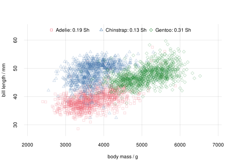
Scatter plot and mutual info for species subpopulations
We see that body mass and bill length have a stronger association in the Gentoo species than in the Adélie or Chinstrap ones. In other words we can more precisely predict body mass from bill length, or vice versa, for Gentoo penguins than for the other two species.
Uncertainty about associations and revisability of mutual information
Any measure of association that we calculate from a finite sample of data is obviously uncertain: a much larger data sample might reveal a stronger or weaker association. Likewise, the mutual association that we calculate from a finite sample of data is subject to a possible “revisability”, in the sense that if we collected many more data, and calculated the mutual association from them, we could find a slightly different – or maybe the same – value.
The function mutualinfo() calculates not only the mutual
information between two groups of variates from the present dataset. It
also calculates the possible revisability of the mutual information, if
more data were collected, together with the probability of such a
revision.
Let’s see for example how much variation we can expect in the case of
the association between island and
species. One way to ask this is “with more data, what would be
value of the mutual information between island and species, with 89%
probability?”. The answer was already calculated by
mutualinfo(), and can be seen with the utility function
print():
print(MIislandspecies)
# value/Sh      +/-    Q5.5%     Q25%     Q75%   Q94.5%
#   0.6266   0.0044   0.5530   0.6006   0.6669   0.7075
which shows that, acquiring more data, we can expect with 89%
probability a mutual information between 0.55 Sh and 0.71 Sh. We can
also visualize our uncertainty about this “long-run” mutual information
by means of a probability distribution, using the hist()
function:
hist(MIislandspecies, col = 4)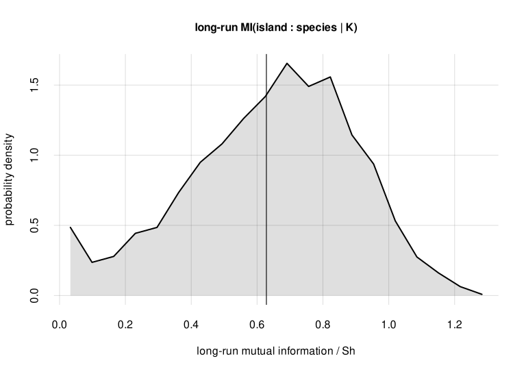
Revisability of mutual information with a much larger data sample
Appendices
References
Anscombe (1973): Graphs in statistical analysis.
Cover, Thomas (2005): Elements of Information Theory, 2nd ed.
Goodman, Kruskal (1954): Measures of association for cross classifications.
MacKay (2005): Information Theory, Inference, and Learning Algorithms.
Chapter “Information, relevance, independence, association” in Data Science and AI Prototyping.